Someone sets up a monitor: “alert me when daily revenue drops below $X.” The Monday after Thanksgiving, it fires. Every weekend, it fires. After the January discount promo, it fires. A month in, the alert gets muted. Six months later, revenue actually does fall off a cliff, and nobody notices for two weeks because the channel was already dead.
This happens because static thresholds are the wrong tool for real business metrics. The data has shape — trend, cycles, noise — and a threshold treats all of it as the same number. What follows is how actual anomaly detection is done: the three algorithm families that handle the different shapes, the tradeoffs between them, and the layered approach we use so the alerts that reach a human are the ones worth reading.
What an “anomaly” actually is
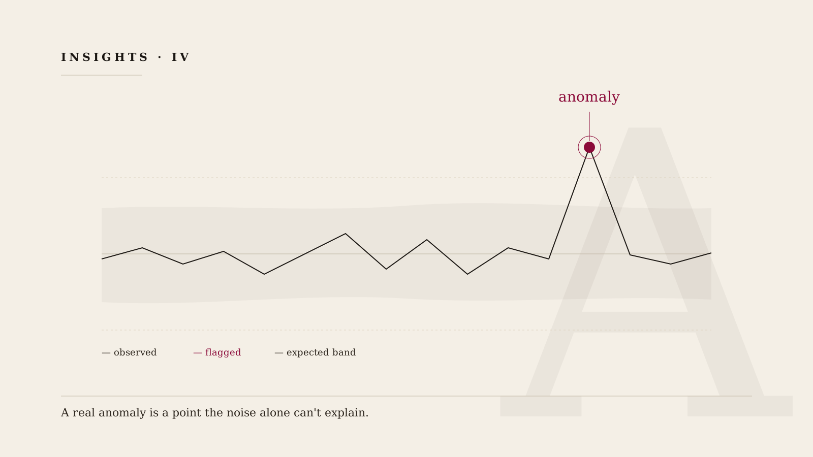
The working definition we use: an anomaly is a value that doesn't fit the pattern the metric has been following. The pattern is built out of three ingredients, and every detector worth its salt is some way of subtracting them:
- Trend — the slow direction of travel. Revenue growing 2% a month. Support tickets drifting up as the customer base expands.
- Seasonality — the repeating cycles. Logins peak at 9 AM. Orders dip every weekend. Ad clicks fall every December 24th.
- Noise — the random jitter that's left over after you subtract trend and seasonality. Noise has a shape too: a scale (how jittery is this metric normally?) and a distribution (is it symmetric, or does it spike up more than down?).
A real anomaly is a value the noise alone can't explain. Every technique below is a different way of asking that same question.
Family 1 — Rolling statistics (fast, no seasonality)
The simplest approach: keep a rolling window of recent values (the last 24 hours, the last 7 days), compute a center and a spread, and flag any new value that's too far from the center.
The version that actually works in practice uses the median and the median absolute deviation (MAD) instead of mean and standard deviation. The reason is important: the mean is dragged around by every extreme value, so the first real anomaly poisons the detector and desensitizes it for days. The median and MAD barely move when one point goes crazy, which is exactly the behavior you want in a thing whose whole job is to notice when a point goes crazy.
Strengths: reacts fast, runs cheap, works on metrics that don't have an obvious cycle (queue depth, error rate, free disk space). Weaknesses: completely blind to seasonality. Put it on a metric with a weekly pattern and it will flag every Monday morning as anomalous forever.
Family 2 — Seasonal decomposition (the workhorse)
Most business metrics have cycles. Orders, logins, ticket volume, page views, ad spend — all of them rise and fall on some predictable schedule. You cannot detect anomalies in these metrics directly; the cycle swamps the signal. You have to subtract the cycle first.
That's what seasonal decomposition does. A technique called STL — Seasonal-Trend decomposition using Loess takes a time series and splits it into three pieces: a trend component (the slow drift), a seasonal component (the repeating cycle), and a residual (everything else). The detector goes on the residual, not on the raw series. A Monday-morning spike that matches every other Monday morning shows up in the seasonal component, not the residual. It is not an anomaly, because it was expected.
The subtle part is that the seasonal component has to be learned from enough history. Weekly seasonality needs three or more weeks of data before the decomposition is stable; annual seasonality needs multiple years. A detector that's confidently reporting weekly anomalies on a two-week-old metric is guessing.
Strengths: handles the huge class of business metrics that have a cycle. Weaknesses: slow to adapt to legitimate level shifts. If you launch a new product and daily orders jump 40%, seasonal decomposition will keep flagging the new baseline as anomalous for weeks until enough post-launch history accumulates.
Family 3 — Forecast-based (predicts, then compares)
The third approach inverts the problem. Instead of modeling what the past looked like and flagging points that don't fit, forecast a short distance into the future, build a prediction band around the forecast, and flag any actual value that lands outside the band.
Classic tools here are SARIMA (seasonal autoregressive integrated moving average), Holt-Winters exponential smoothing, and Prophet. They all do broadly the same thing: learn trend + seasonality + uncertainty from history, produce a forecast, and widen the confidence band the further out they predict.
The widening matters. It correctly encodes “I'm more confident about tomorrow than about next week,” which means a surprise one day out is a much stronger signal than the same deviation a month out. You get severity for free: how many band widths outside the forecast is the actual value? That number is the z-score of the anomaly.
Strengths: handles multi-layer seasonality (daily-inside-weekly-inside-annual), gives you severity scores natively, fits cleanly into a dashboard. Weaknesses: more compute than the others; sensitive to what's in the training window. Train it on a period containing a past outage and it will happily learn the outage as normal.
The tradeoff nobody tells you about — fast vs. stable
There is one decision baked into every anomaly detector, and it has no universally right answer: how quickly should the detector adapt to a new baseline?
A fast-adapting detector handles legitimate level shifts well — a product launch, a pricing change, a new customer cohort. It also, unfortunately, adapts quickly to outages. If the metric crashes and stays crashed, a fast detector will decide the crashed value is the new normal in a few days and stop alerting.
A stable detector holds its baseline. It will catch the long slow sag that a fast detector would have normalized. It will also flag every legitimate step change for weeks, until enough new history accumulates for the new level to become the baseline.
The practical move is not to pick one. Run both. Treat their disagreement as information: when the fast detector says everything is fine and the stable detector is still firing, that is itself a thing worth knowing.
“A metric's seasonality is a feature of the data, not a setting in the dashboard. Detectors that don't learn it will wake you up every Monday.”
How we do it — a layered approach
We don't pick one algorithm per metric. We run a small ensemble in parallel, because each family catches a failure mode the others miss. The approach has six moving parts:
- Multiple detectors, one metric. A rolling-MAD detector, a seasonal-decomposition detector, and a forecast-band detector all score every point. Three independent looks at the same value.
- Severity, not booleans. Each detector emits a z-like score (how many “noise units” away from the expected value) rather than a fired/didn't-fire flag. Three moderate scores is often a stronger signal than one loud one.
- Learned seasonality. If three weeks of history show a weekly pattern, we use it. If they don't, we don't force a seasonal model on a metric that has no cycle. The default is to let the data tell us.
- Context on every firing. An anomaly without context is noise. Every firing carries: what other correlated metrics moved in the same window, what upstream jobs ran, what deploys or config changes happened nearby. That's the difference between an alert and a starting point.
- Grouping and deduplication. Five correlated metrics firing at 09:14 is one incident, not five alerts. An anomaly detector that doesn't group is an alert-fatigue generator.
- A feedback loop. Every alert a human marks “not real” tunes thresholds for that metric. Every alert marked “should have fired sooner” widens the window. The detector gets better by being used.
In pseudo-code, the per-point logic looks roughly like this:
def score(metric, value, history):
    # three independent views of "is this weird?"
    s_mad      = rolling_mad_zscore(value, history, window="7d")
    s_seasonal = stl_residual_zscore(value, history, period="weekly")
    s_forecast = forecast_band_zscore(value, model_for(metric))

    # combined severity (max, not average — any detector can raise the flag)
    severity = max(s_mad, s_seasonal, s_forecast)
    if severity < FIRING_THRESHOLD:
        return None  # quiet

    # enrich before anyone sees it
    context = {
        "correlated_metrics": find_correlated_movers(metric, window="30m"),
        "upstream_jobs":      recent_jobs(window="2h"),
        "deploys":            recent_deploys(window="2h"),
    }

    return Anomaly(metric, value, severity, scores=(s_mad, s_seasonal, s_forecast), context=context)
Three scores, one severity, context attached, grouping handled downstream. Nothing glamorous. The point is that each piece is doing a job the others can't.
One drop, three detectors
The cleanest way to see why the ensemble matters is to run a real drop through each detector and watch what happens.
The metric is daily new support tickets. Mondays are normally a rebound from the weekend low. This particular Monday, tickets come in at about 60% of the usual Monday level.
- Static threshold (“alert below 50 tickets”): silent. The Monday value is above 50. The threshold has no way to know Monday is supposed to be high.
- Rolling MAD alone: fires — but it also fires every weekend, so nobody pays attention when it fires on Monday either. Alert fatigue has already muted the channel.
- Seasonal decomposition: the weekly cycle predicted a Monday rebound. The residual shows a large negative value. Fires clearly, on the right day, for the right reason.
- Forecast band: the forecast expected a Monday-typical rebound. The actual value lands well below the lower bound. Fires with a severity score — roughly 3.8 band widths below expected — that tells the operator this is a meaningful drop, not a borderline one.
The right anomaly got caught by the two right detectors. The wrong ones either stayed silent or had already trained the operator to ignore them. This is why the ensemble beats any single algorithm — each covers a blind spot the others have.

How we think about this at RevenuePoint
Anomaly detection isn't one algorithm done well. It's a small ensemble chosen for the shape of the data, running in parallel, emitting severity instead of booleans, grouped into incidents, and enriched with the context a human would otherwise have to dig for. Get that stack right and the alerts that reach a person are the ones worth reading — which is, in the end, the only definition of a useful alert.